Choosing the right color palette in interior design goes far beyond mere aesthetics. Colors influence our emotions, behaviors, and even productivity. The shades you pick can make a room feel cozy, energizing, or calming, often without you even realizing it. Understanding the psychology behind colors allows homeowners and designers to craft spaces that truly resonate with their intended mood and function.
Understanding Color Psychology
Color psychology explores how hues impact human perception and emotions. Historically, artists and designers have recognized that certain colors evoke specific reactions, from calmness to excitement. Warm tones like red and orange can stimulate energy, while cool colors such as blue and green promote relaxation and focus. Neutrals, including beige, gray, and white, often provide balance and sophistication, acting as a canvas to highlight other tones in a space. Recognizing these associations is crucial in creating interiors that not only look good but feel right.
Primary Emotions Associated with Colors
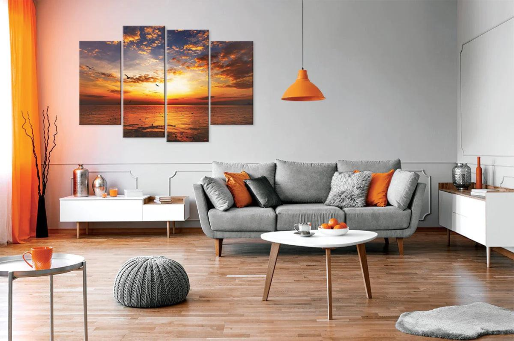
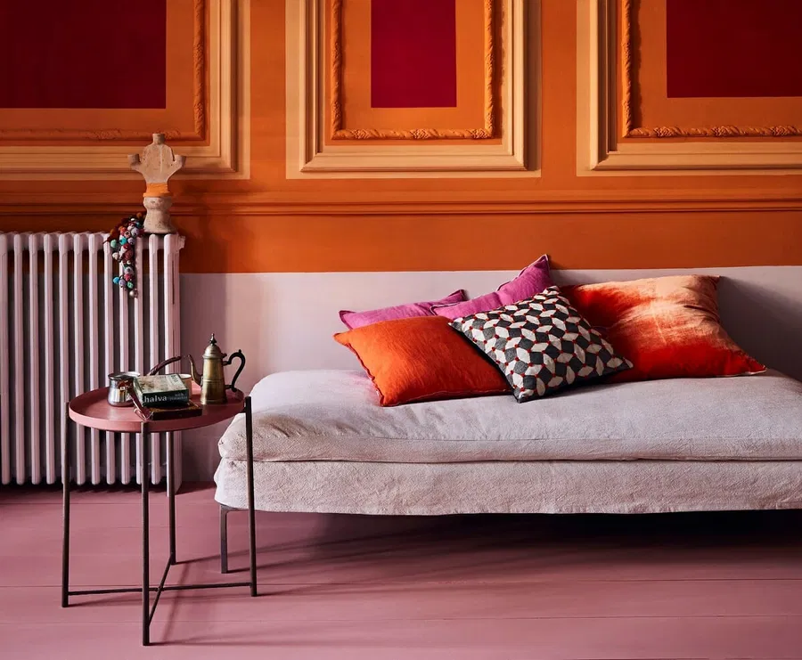
Every color carries emotional weight. Red can energize a space and evoke passion, while blue fosters calm and concentration. Green often feels refreshing and natural, purple brings creativity, and yellow can stimulate optimism. Neutrals provide stability, ensuring rooms do not feel overwhelming, and serve as a grounding element that allows accent colors to shine. By understanding these emotional effects, designers can strategically select hues that align with the purpose of each room.
How Colors Affect Different Rooms
The function of a room heavily influences the best color choices. Living rooms, where social interaction occurs, benefit from colors that encourage warmth and conversation. Bedrooms, on the other hand, demand tranquil shades to promote restfulness and serenity. Kitchens and dining areas thrive with colors that stimulate appetite and energy, making meals more enjoyable. For home offices and study areas, hues that enhance focus and creativity can significantly impact productivity. While personal taste plays a role, awareness of these psychological effects ensures a harmonious and purposeful environment.
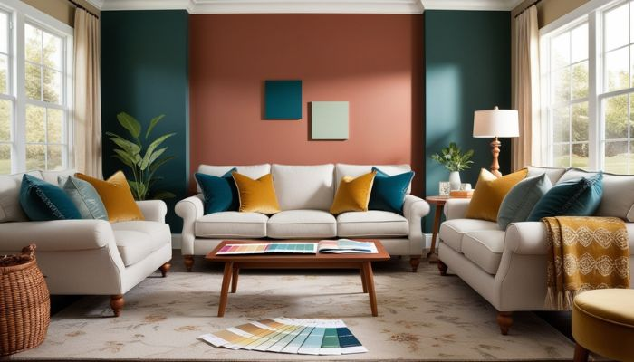
Combining Colors: Creating a Harmonious Palette
A successful color palette combines multiple tones without overwhelming the senses. Techniques such as complementary, analogous, and triadic schemes allow for balance while keeping interest alive. Accent colors should be used thoughtfully to draw attention to key elements or create visual focal points. Equally important is proportion; an overabundance of one color can dominate a space, while subtle touches can enhance the overall aesthetic. By combining colors mindfully, interiors can feel dynamic yet cohesive, expressing both style and emotional intent.
Trends in Interior Color Design
Interior color trends evolve alongside cultural shifts and design innovations. Modern homes often embrace muted and earthy tones, reflecting a desire for calm and connection to nature. Bright accent colors are frequently employed to inject energy into minimalist spaces, while seasonal palettes can influence the atmosphere subtly, from the warmth of autumn hues to the freshness of spring pastels. Staying informed about trends allows homeowners to make contemporary choices without sacrificing timeless appeal.
Practical Tips for Choosing the Right Palette
When selecting colors, context matters. Lighting dramatically affects how a hue appears, so testing swatches in different conditions is essential. Materials and textures, such as furniture, flooring, and fabrics, interact with paint colors and must be considered. Personal preference should always be balanced with the psychological impact of color; a bold red wall might seem thrilling but could create tension in a bedroom. Consulting a professional can also provide insights that blend taste with expertise, ensuring that the palette supports both aesthetics and function.
Common Mistakes in Color Selection and How to Avoid Them
Overuse of bold colors can overpower a room, making it feel chaotic rather than vibrant. Ignoring lighting can result in a hue that looks dramatically different than expected. Clashing patterns or shades can disrupt harmony, making spaces feel uncomfortable. Awareness of these common pitfalls allows homeowners to refine their choices, achieving a color scheme that enhances rather than detracts from the overall design.
Color in interior design is far more than decoration; it is a powerful tool that shapes experiences and emotions. By understanding color psychology, considering the purpose of each room, and blending hues thoughtfully, anyone can create spaces that are visually appealing and emotionally supportive. Choosing the right palette transforms interiors into environments that inspire, soothe, and energize.